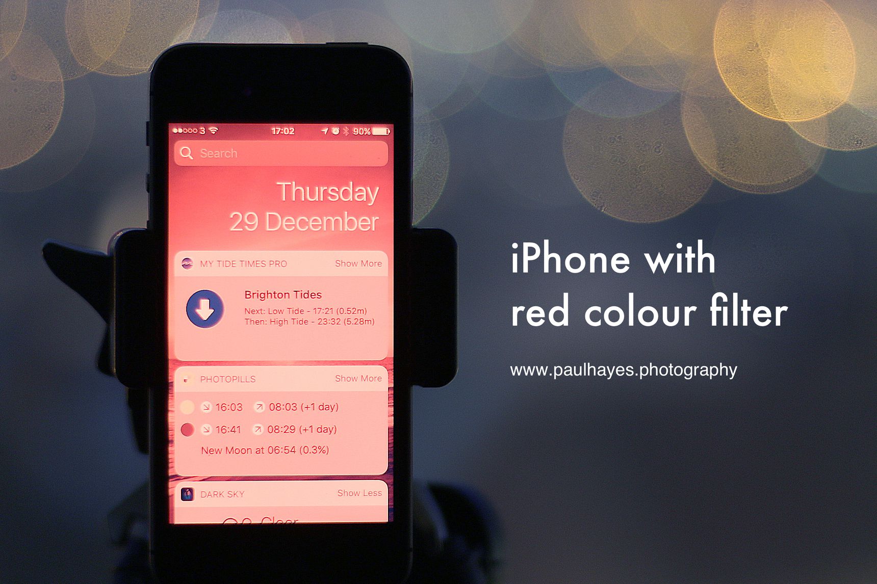
Using red light at night preserves your eyes’ adaptation to the dark. Many iPhone apps come with a red night mode, especially those used for stargazing. However the operating system and other apps still appear bright and blue – even with night shift enabled. A bright flash from your phone and you need to let your eyes adapt to the darkness again.
Use a red colour filter to put your iPhone and all apps into a red night mode, to let you use your phone and preserve your night vision. It’s useful for astrophotography, in the dark room, or simply using your phone at night.

Your eyes in the dark
When out at night it takes a while for your eyes to acclimatise to darkness. The cone cells in your eyes, those that process colour, take 10 minutes to optimise, while the rods – more sensitive and vital for night vision, can take up to 40 minutes to adapt to conditions. If you’re stargazing, when your eyes are ready so many more stars are visible and the night sky appears fuller.
When light levels are low your eyes use only the rods to see. Things appear in black and white only, are less sharp, and it’s hard to see detail. When you need to read, or do something precise, a little extra light helps. Red light activates your cone cells to allow you to see detail, without de-sensitising your rod cells, which you’re using for night vision. Rod cells in your eyes are not sensitive to red light. This is the Purkinje effect. That’s why we use red light headlamps and apps have red-only night modes. It’s why red colour filters on your iPhone are really useful.
Create a red colour filter
iOS 10 comes with a number of accessibility settings. Some people have trouble viewing certain colours, the most common being red-green colourblindness. Under the accessibility options there’s a “Display Accommodations” setting that lets you tweak the colours your iPhone displays.
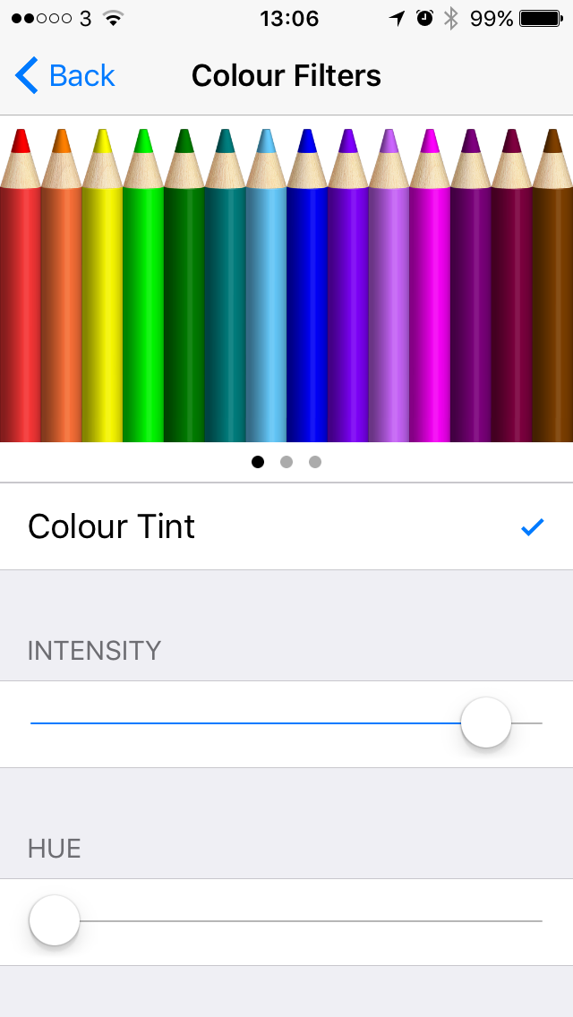
Below greyscale and the common colourblindness filters you’ll find a fourth option, select “Colour Tint”. Colour tint lets you apply a tint to the entire iPhone screen, across all apps.
At the bottom are two sliders, one for intensity and one for hue. Pull the hue to the far left for the darkest red, and shift the intensity all the way right, then pull it back a little. Apps use blue and green in their designs – eg links in the official twitter client, full intensity can make this text completely illegible whereas a lower value means it’ll be readable.
* General
  * Accessibility
    * Display Accommodations
      * Colour Filters

Triple-click the home button to turn on and off
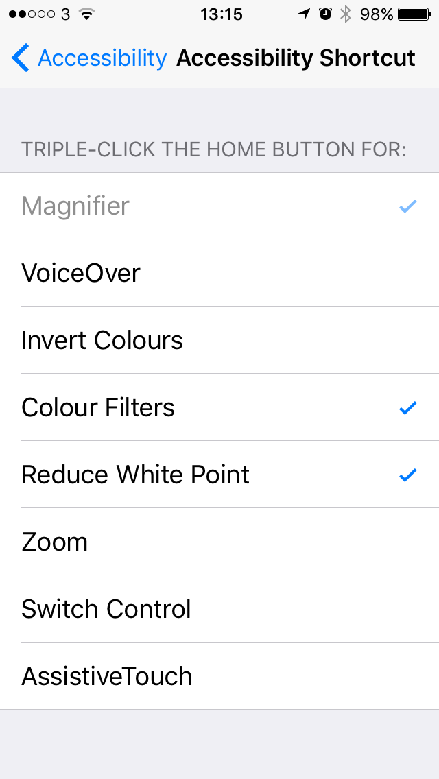
Accessibility features aren’t always needed. You won’t want your screen red all the time. Luckily Apple has provided a quick way of turning them on and off – an accessibility shortcut. At the bottom of the Accessibility options screen select “Accessibility shortcut”, then select “Colour filters”.
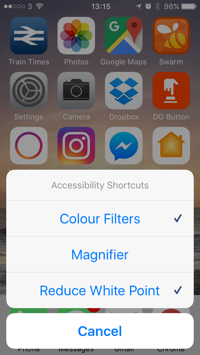
By triple-clicking your phone’s home button you can now enable or disable the feature. If you’re using more than one accessibility feature (I use “Reduce White Point” as well) then a menu will pop-up asking which features you want to enable.
* General
  * Accessibility
    * Accessibility shortcuts

